The curve starts very low, actually negative since the population drops from positive to zero. Then it rises steeply, falls steeply and levels off below replacement. That is the model. We look for data in the real world to compare.
This is more or less the poster I am presenting in Albuquerque
Severe Infertility from Normal Genetic Variation
M. Linton Herbert MD
I have not been paid by any commercial enterprise (or anybody else for that matter) for this work.
THE COMPUTER SIMULATION
Various parts of the genome must be fine tune together. The genome has been optimized by evolution. Infertility can occur at meiosis. I have written a computer program that formalizes these points and uses the standard Mendelian genetic laws to follow the fertility of virtual populations.
Parameters for each point are:
10 simulations averaged.
Populations followed to extinction or to 1,000 generations.
Maximum of 6 offspring per couple.
Initial population 100.
Maximum population, tracked on the x axis, limited by eliminating offspring at random as necessary. (Number of offspring per individual in the maximum population in the final generation [minus one to replace that individual] tracked on the y axis.)
100 gene pairs subject to recessive lethal mutations.
10 mutations per site per 100,000 generations.
100 gene pairs subject to detuning mutations. (In fact it amounts to 200 per chromosome.)
400 mutations per site per 100,000 generations.
40 one thousandths of one offspring lost at meiosis per unit of detuning.
No populations were added from saved files.
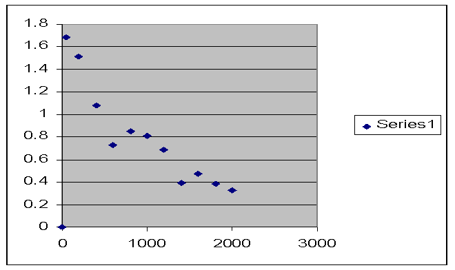
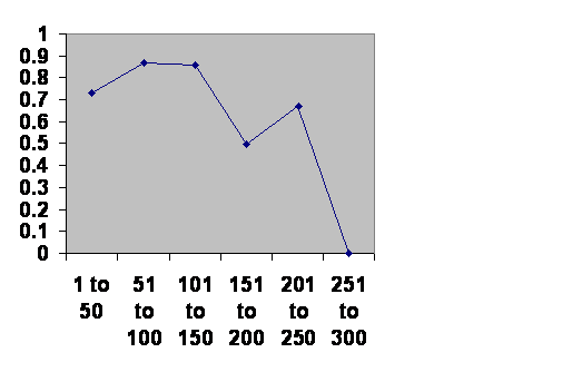
THE “n” SHAPED CURVE
When the results are graphed, one gets a shape somewhat reminiscent of a lower case “n” in Carolingian Miniscule on a cold day. Vertical axis is the number of offspring per individual in the population. Horizontal axis is population size.
The curve starts very low, actually negative since the population drops from positive to zero. Then it rises steeply, falls steeply and levels off below replacement. That is the model. We look for data in the real world to compare.
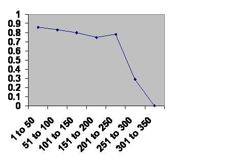
EXPERIENCE WITH FIELD COUNTS OF ANIMALS
A study was done collecting annual field counts of wild animals and comparing growth rate (on the vertical axis) with population size calculated from population density (on the horizontal axis.)
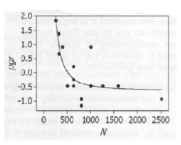
Graph is from On the Regulation of Populations of Mammals, Birds, Fish and Insects, Richard M. Sibly, Daniel Barker, Michael C. Denham, Jim Hope and Mark Pagel SCIENCE vol. 309 July 22, 2005 page 609.
This is a typical curve from what they found. Since we know a high degree of inbreeding is deleterious, we can assume the curve starts very low and then rises steeply. This was not actually observed although the study just about exhausted suitable field studies. The curve then falls steeply and levels off below replacement. It is the same curve.
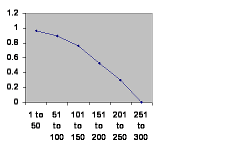
EXPERIENCE FROM THE ICELAND GENEALOGY
A study was done using the extensive Iceland genealogy. What they did was to take a cohort of couples. Going back ten generations, they counted the number of shared ancestors and from that calculated their degree of kinship (second cousins, third cousins and so forth) and compared that with the number of children and grand children, offspring on the vertical scale, kinship on the horizontal. This is the graph for children.
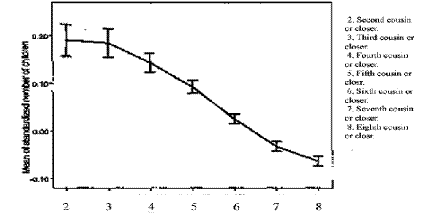
Graph is from An Association between Kinship and Fertility in Human Couples, Agnar Helgason, Snaebjoern Palsson, Daniel Abjardson, Pordur Kristjansson and Karl Stefanson, SCIENCE vol. 319 February 8, 2008 page 813.
It is the same curve, although again very intense inbreeding was not found. Notice that these are upper limits of kinship in the usual sense. One may be fourth cousins in multiple directons for instance. Notice also that the optimal degree of kinship is surprisingly close. What is labeled as third cousin is third cousin “or closer.” In other words it is second cousin once removed.
When they looked at grandchildren they did indeed find a degree of decreased reproductive success at what they call second cousin or closer, in other words first cousin once removed.
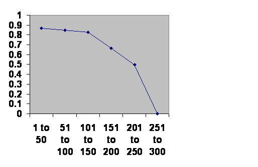
EXPERIENCE FROM THE DENMARK STUDY
A study in Denmark compared fertility with the distance between birthplaces of couples.
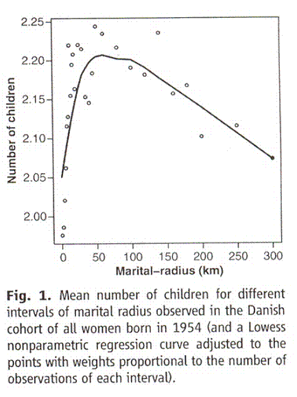
Graph taken from Comment on “An Association Between the Kinship and Fertility of Human Couples,” Rodrigo Labouriau and António Amorim SCIENCE vol. 322, page 1634b December 12, 2008Vertical axis is number of grandchildren. Horizontal axis is distance in kilometers between the birth places of the parents.
Correcting for the fact that this is distance not area, the curve is the same. This time inbreeding is documented.
THE “m” SHAPED CURVE
By the time the model population reaches 2,000 it is already below replacement levels. I did some runs with a population permitted to rise to 20,000. Here is the result of one run.
Offspring on the vertical axis; generations along the horizontal. Because of the limits of how many things the computer can keep track of, the curve is truncated. It ought to look more like an “m.” Unsurprisingly a population tested by such a high limit goes extinct regularly. Also notice that it tends to cycle with each cycle being of a characteristic number of generations. The number of generations per cycle is actually much greater than the number in real life. (This curve is the integral of the “n” shaped curve.)
Occasionally this double cycle occurs. With more tweaking a program can be made that will cycle twice more often than – or at least as often as – any other number of cycles before extinction.
THE SOUTHERN MESOPOTAMIAN EXPERIENCE
I looked up the ages of Mesopotamian empires to see how long they had lasted. Then I lumped them into 50 year batches and at each half century interval calculated the chance they would survive another fifty years. This was the result.
Information taken from R. H. Carling THE WORLD HISTORY CHART International Timeline Inc. Vienna, VA 1985. The experience of Southern Mesopotamia. The vertical axis is The chance of an empire of any age continuing to rule locally for another 50 years. The horizontal axis is the ages of the empires. I broke the Ottoman Empire into two, because their Janissary elite came from two different sources during the early and late empire.
We can see that empires age just like people with older ones being more vulnerable than younger ones. At 150 years many survive; at 300 all are gone. So there does seem to be a characteristic lifespan.
The survival curve drops steeply. (Extrinsic causes would give a horizontal line; intrinsic would give a rising line.) It would appear that the elite, not actually the common people, enjoying a broad social horizon have a population collapse. The number of cycles is unclear. The line is almost linear since the rise of a civilization starts when the prior one collapses, which is unrelated to the age of the rising empire.
THE MAYAN, ROMAN AND CHACO CANYON EXPERIENCE
 The Romans, the Mayans and the Chaco Canyon Anasazi Indians all established vigorous civilizations that underwent cycles, but none went through enough cycles to be statistically interesting. Here is what happens when you pool them.
Information taken from BBC and The Collapse of Complex Societies. Joseph A. Tainter. Cambridge University Press. Cambridge. Eighteenth printing, 2009. The age of each regime when it fell is on the horizontal axis in 50 year increments. The vertical axis is its chance of surviving that half century after it has entered that half century. If the viability of a regime had nothing to do with how long it was since it was founded, the line would be horizontal. If regimes get better at surviving as they are, the line would rise.
The curve is essentially the same as that for Southern Mesopotamia.
THE CHINESE EXPERIENCE
Information taken from John B. Teeple TIMELINES OF WORD HISTORY, DK Publishing, New York, NY, 2006, page 554, 555 Chinese dynasties. The vertical axis is the chance that a dynasty of that age will survive another 50 years. The horizontal axis is the age of the dynasties.
In China the imperial family enjoys a broad social horizon. Just about everybody else is a primary producer with a restricted horizon. When one dynasty fails whoever takes over starts out with the tight knit gene pool or a primary producer. Now indeed they all seem to last just about the same length of time. Notice that there is a small notch part way through, a time of crisis not all survive. Thus there is a hint, just a hint, that the 300 year brick wall is a two cycle span.
THE JAPANESE EPERIENCE
Information taken from John B. Teeple TIMELINES OF WORD HISTORY, DK Publishing, New York, NY, 2006, page 554, 555 Japanese dynasties. The vertical axis is the chance that a dynasty of that age will survive another 50 years. The horizontal axis is the age of the dynasties.
This time there is a short shakedown period which is over in a couple of generations. Unlike China, Japan has had powerful families who might challenge the new dynasty. After that the curve is much like that for China although they do tend to fail earlier. There is again the notch, which still could be a coincidence, but since it comes at the same age as the one for China is suggestive of a two cycle pattern.
LONG HOUSE VALLEY EXPERIENCE
Here is a graph published by Jarred Diamond, the author of Guns, Germs and Steel and more recently of Collapse.
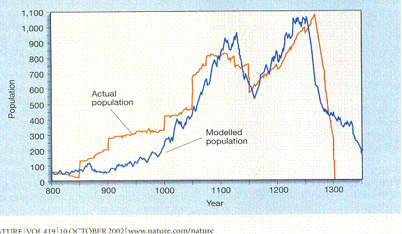
Jared M. Diamond, “Life with the Artificial Anasazi,” NATURE, vol. 419 no. 6907, October 10, 2002 p 567.
Long House Valley in the American Southwest was occupied for some centuries by Anasazi Indians, also called Ancestral Puebloans. The red line indicates the population in each year that the valley was occupied as calculated by counting the number of dwellings that had been occupied in each year. The blue line is rainfall as calculated by tree ring thickness. Dates are along the bottom.
Obviously the curves match so closely that either they have a common cause or one causes the other. Diamond’s thesis is that the population is being limited by rainfall. But there is a problem with this interpretation. For about 200 years in the early days there were more people than the assumed rainfall could support. In fact, if we interpret vertical segments of line to mean people moving in rather than unlikely spikes in the birth rate, then people were moving in only to starve. So it seems at least as likely to assume that people were somehow cultivating the trees. Either they were pruning them for firewood or they were making a deliberate effort to get them to grow. I favor the latter interpretation since these were expert farmers. Nobody else has ever been able to scratch a livelihood out of that valley.
If people move in in groups, then people should move out in groups. Similarly war, famine or disease would be expected to cause vertical falls in the number of occupied dwellings. None of these things happened in the final decline. That leaves infertility as just about the only likely cause. If the population collapsed in about the year 1300, and if we judge the lifespan of a population that reaches excessive size to be 300 years, then it seems reasonable to suspect that the population crossed that fateful threshold in about the year 1000. That seems quite reasonable from looking at the graph.
So it seems that we do indeed have a population of very modest size that parallels the course of great empires and it is hard to escape concluding that it is doing this for the same reason.
It is also now clear that there are two cycles. There is a roughly 150 year primary cycle and a more severe 300 year cycle.
THE EASTER ISLAND EXPERIENCE
There is a bigger isolated population that has been studied that is still smaller than an empire. Here is a graph of the population of Easter Island.
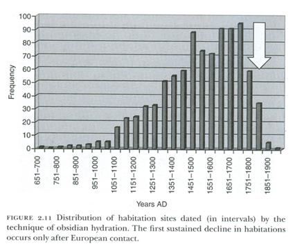
Chapter 2 Terry L. Hunt and Carl P. Lipo ”Ecological Catastrophe, Collapse, and the Myth of “Ecocide” on Rapa Nui,” Questioning Collapse, Cambridge University Press, Cambridge 2010.
Superficially the curves look very similar. There is a long period of low population followed by exponential growth, followed by a notch, followed by recovery and then catastrophic collapse. However the time scales are very different. Easter Island is bigger than Long House valley, and there were multiple tribes, presumably mutually separated. We are no doubt looking at the overlapping histories of multiple tribes. If we measure back three hundred years from 1851 – 1900 to 1551 – 1600 we do find a crisis they somehow survived.
The authors Hunt and Lipo attribute the final decline to the advent of Europeans as indicated by the vertical white arrow. But that can not have been the case in the first decline, and is unnecessary to account for the final decline. In fact maybe for once Europeans enabled the islanders to survive their most recent crisis. That would be nice.
A POSSIBLE MECHANISM
The sperm in highly promiscuous animals may form a sort of flying wedge formation that lets them swim faster. Here are two formations, a head to head one and a head to side one.
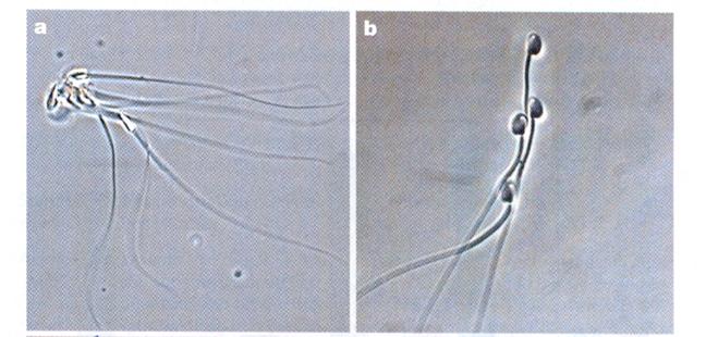 Pictures from Competition Drives Cooperation Among Closely Related Sperm of Deer Mice, Heidi S. Fisher and Hopi E. Hoekstra, NATURE vol. 463. no. 7282 February 11, 2010 page 801.
The sperm of closely related males are more likely to form such teams than the sperm of unrelated males of the same species. Thus sperm both display and read something about the DNA and kinship with other sperm. If they match, they get together. All that is needed is that the egg under the same selective pressure does the same thing and the mechanism exists and accounts for everything else on the poster plus speciation. In fact, the computer program I have used more closely matches such a mechanism than it matches signal vs. receptor detuning. It has been found that directly injecting sperm can produce a pregnancy that would not normally arise. Perhaps this bypasses a safety check. Informally I have been told that fertility experts, “Inject a lot of eggs, look at the embryos and implant the best looking one.” (At least some can have babies. See “Are test tube babies healthy, SCIENCE vol. 327 no. 5969 February 26, 2010 page 1071.)
INTEREST IN THE ISSUE
Here is the traffic on the web page nobabies.net that takes an interest in this issue. It goes from the beginning in June, 2009 and goes through January, 2010. Visitors are blue, new visitor red and pages turned are yellow.
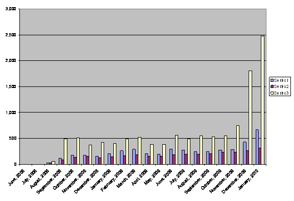
Traffic was low and stable until about October, 2009. At that point there was in increase in the number of visitors coming to the site, in the number of visitors coming back for another look and particularly in the number of pages turned.
Reading in the web site is not convenient. The entries are longish so the reader has a choice between printing out an entry or spending some time reading it from the monitor. Do not underestimate the effort that the readers have put in. They are few but passionate.
There have been 3,545 visitors so far.