This, more or less, is a supplement to the Albuquerque poster, images I could not squeeze into the space they promised:
1. Sperm aggregate stained with Tubulin Tracker.

It seems like much of the surface of the sperm is given over to tubulin, whatever that means with little local variation; perhaps the whole surface of a sperm here is devoted to binding to kin, so it is probably the same mechanism that binds it to an egg. That is one function that should not be compromised.
2. Here is the survival experience of Egypt. 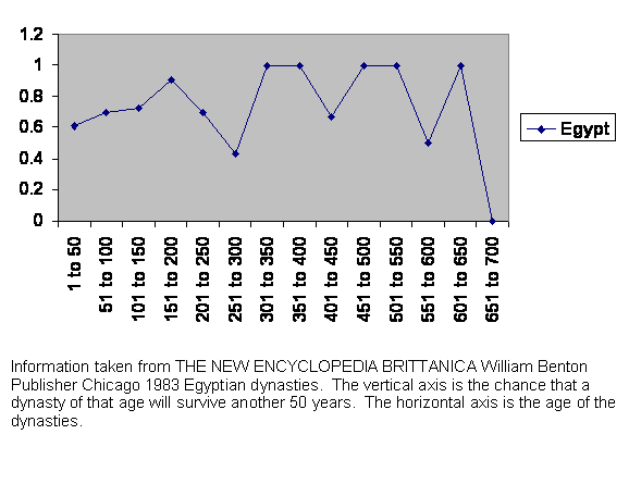 Egypt lies along the Nile and setting up an administration is difficult. If you have a problem 20 miles upstream you don’t know what is happening on the other side of the rebellion. It takes a couple of centuries of shakedown and about that time there is the three hundred year plunge. A few survived. They seem to have come up with the answer to the demographic problem because they are almost immortal. Notice that the plunge into 300 years has the same characteristic shape or the m curve as other geographic areas at the same age.
3. Black footed ferrets released into the wild. Notice that there is a pause between the last release and approximately exponential growth, just like the “m” curve. Even the growth is not quite exponential, matching the growth at the same time in the “m” curve.
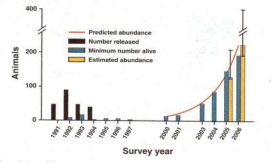
Rapid Population Growth of a Critically Endangered Carnivore. M. B. Grenier, D. B. Macdonald and S. W. Buskirk SCIENCE volume 317 10 August 2007 page 779 figure 1. The vertical black bars are the number of black footed ferrets released. The vertical grey bars are the number counted. Years of release or counting are along the horizontal axis.
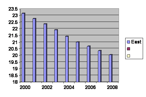
4. World birth rate by region. Here are the UN numbers for the past 50 years. It is birth rates broken down by developed, less developed and least developed regions.
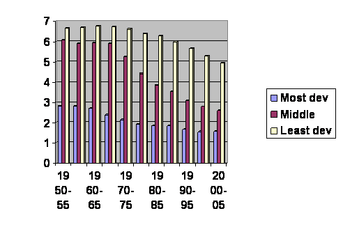
The vertical axis is the average number of children born per woman. The horizontal axis gives the dates of the surveys.
If you cut and paste, it is obviously the “n” curve.
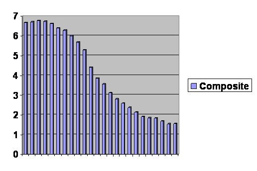
5. Developed World Birth Rate
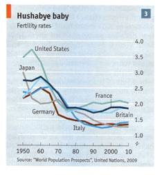
THE ECONOMIST vol 392 no 8637, “A slow-burning fuse,” page 5, “Suffer the little children” June 27, 2009. Information is from “World Population Prospects, United Nations 2009.
You wanted N shaped curves? Breaking it down by advanced countries, we are all riding the “n” curve down as our effective gene pool size rises.
6. The Domesday Book Experience
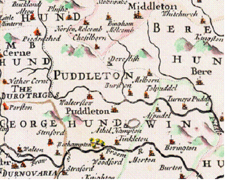
Part of a map of Dorset published in 1695. A “hund” is a hundred “hides” (enough land to support a family) and measures about 6 miles across. From center to edge is about an hour’s walk with a two-way cost of 6 hundred kilocalories. That would be about the limit of a young person’s social horizon. The villages are actually smaller than hunds, but probably not air tight. About a hundred families might make up a social pool. The Domesday Book chronicled thousands of villages shortly after 1066. Essentially all are still there after more than 30 generations.
7. Population Size does not Influence Mitochondrial Genetic Diversity in Animals, Erik Bazin, Sylvain Glemin and Nicholas Galtier SCIENCE vol. 312 no. 5773 April 28, 2006 page 570.
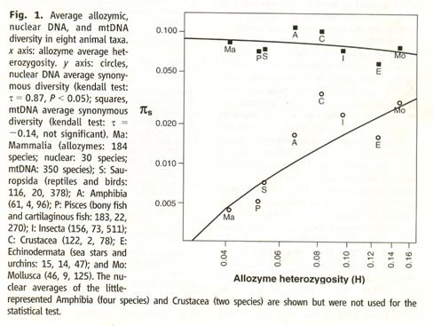
This graph looks backward to me. Mollusks are on the right and mammals on the left. The circles show the effective population size of each as reckoned from nuclear DNA. As you can see, population size drops as complexity increases … or maybe it’s just that males are competing more effectively in higher life forms. Mitochondrial diversity (and thus effective population) actually looks like it goes the other way. Maybe the girls are taking advantage of the fact the boys are bumping each other off. However you look at it, effective population size is just about the same everywhere.
8. German age distribution.
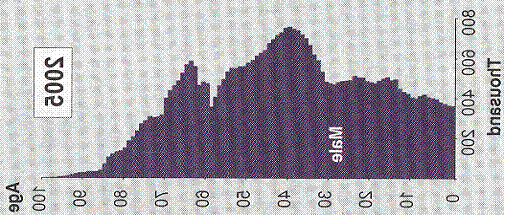
This is a graph of the ages of German males. I flipped it over and turned it to one side for clarity. For the past fifteen years (and ages pretty much represent births in that county for that age bracket) there is just about a linear drop. If that line goes to zero, then the last girl who will ever grow up to have children has already been born. (This graph was taken from the Economist.)
Since the population is aging, a straight line is not to be expected. It will curve down like the end of the “m” shaped curve.
9. Data obtained from
http://www.indexmundi.com/g/g.aspx?c=mx&v=25
and then graphed. The birth rate in Mexico.
Again it looks like a straight line drop, as in Germany, but that cannot last. As the population ages the line should be expected to curve downward.
M. Linton Herbert MD
There have been 3,558 visitors so far.
Home page.