The Arithmetic of the Genetics of Infertility
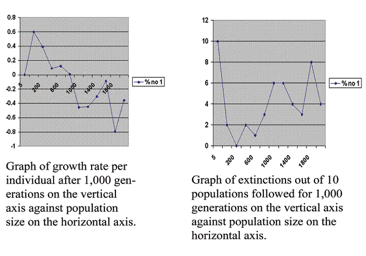
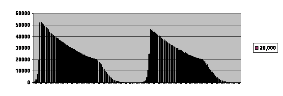
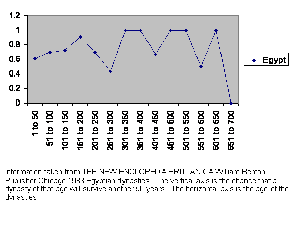
Figure 1 Computer generated graph of virtual population growth on the left and extinction rate on the right graphed against population size.
These two graphs show the problem with the reproductive performance of advanced societies. They show what happens to the birth rate of populations of different sizes. The graphs are calculated from some specific assumptions. The assumptions can be summarized as five statements: The standard laws of inheritance hold. Genes are bound on chromosomes. There are recessive lethal mutations. There are mutations that detune one gene against another. Organisms are sufficiently complex so that the overall mutation rate significantly reduces the number of offspring that develop and mature.
At more length, the assumptions are:
1. Arithmetic is valid.
2. The pseudorandom numbers generated by a computer are good enough for our purposes.
3. Complex organisms, such as people, live as populations of individuals. This assumption is made because we cannot think of any other form complex organisms might take.
4. These organisms reproduce. This is necessary because any physical object can be destroyed, so long term survival requires that individuals be replaced.
5. Information is passed from one generation to the next by genes. This means genes in the most general possible sense. It includes instructions for making structured molecules as well as instructions for when to make them. This is assumed because we cannot imagine an alternative.
6. Each individual has, at some point in its life cycle, 2 copies of each gene. This is a universal observation in higher animals so we assume it must be required.
7. These genes are effectively bound into bundles we call chromosomes. It is possible to demonstrate that abnormal genes are more efficiently eliminated from a population if they are bound on chromosomes. That means an organism with chromosomes can survive a higher mutation rate, in turn meaning it can carry more genes, in turn meaning that it can have more overall capability. At all events, we know that chromosomes exist.
8. Each individual has only 2 chromosomes. That is not generally true, but is taken as the simplest case.
9. Chromosomes are inherited one from each parent; that one is taken at random from one of the parent’s 2.
10. Genes are subject to mutations that damage them and reduce their capability. This is true for the same reason that organisms must reproduce.
11. Some genes are so fundamental that an organism that has 2 damaged copies cannot develop into complex life. These are called recessive lethal mutations. They occur each generation with some probability. That seems inescapable. We assume only 100 such gene pairs because of limitations in available computing power.
12. The probability is the same for all genes subject to such mutations. That cannot be true but is assumed because it is the simplest case. We assume the mutation rate is 10 per site per 100,000 generations.
13. Some genes must be fine tuned to each other. That is true of any mechanism. Because of computer limitations, we assume only 100 such gene pairs.
14. Mutations to these reduce the probability that an organism will reproduce or lower the number of its offspring. The impact of such mutations can be anything from highly damaging to trivial. Highly damaging mutations will be quickly eliminated from the population and cannot accumulate. We shall ignore them. We also shall ignore trivial mutations. In between are significant mutations that can accumulate. We assume all such mutations have the same impact, which cannot be true but is the simplest case. We assume that the impact of 1 step of detuning is 40 out of 1,000 chance of losing a single offspring.
15. Significant detuning mutations all occur at the same rate, have the same impact, and can be corrected by reverse mutation or by mutation in some other gene that corrects the tuning. Similarly, another mutation can increase the degree of detuning. These mutations all occur at the same rate, which we will take to be 400 per site per 100,000 generations. We assume that because it is the simplest case.
16. Combining the effects of the 2 kinds of mutation under consideration must eliminate a significant number of possible offspring. It takes a woman on average about 6 months of trying to become pregnant. In clinical medicine we generally take it that usually those 5 out of 6 months without a pregnancy represent occasions when an ovum was fertilized but the genetic combination was not viable. Our program will not hold us so strictly to account as nature does. Also in the vast majority of cases the mutations we have spoken of do not result in visibly impaired members of the population but simply months in which a woman or other female tried to but did not become pregnant.
17. We assume that all individuals in the founding generation have no bad mutations. We do that because it is the simplest case.
18. Once two individuals mate, they remain mates for the duration or their reproductive experience. We assume that because it is the simplest case.
19. When a population reaches 1 or zero, it goes extinct. That is because it must.
20. The number of offspring in an extinct population continues to be zero per parent, even though there are no parents, in all subsequent generations. It is also possible to account for lost populations by considering the number of generations it took to go extinct and the maximum population, but we have found that the result is essentially the same.
21. We assume that a population that appears to be stable over 1,000 generations is indeed stable, because that seems like a fairly long time.
21. Specifically, we usually follow our populations for up to 1,000 generations.
23. We assume a maximum of only 6 offspring per pair before offspring are eliminated by mutations, because of limitations to our computing power.
24. We assume we start with a population of 100 because we must start somewhere.
25. It is not the absolute numbers that are important here, but their pattern and relationships. 26, Two pseudorandom numbers from the computer mutiplies together are sufficiently random for our purposes. (Added on 7/10/8.)
Having made these assumptions, we simply do the arithmetic by whatever means seems convenient. In this case I used a computer program in C language. I calculated the growth rate, number of offspring produced by an average member of the population above replacement, in the 1,000th generation. I calculated this for populations of 5, 20, 200, 400, 600, 800, 1,000, 1,200, 1,400, 1,600, 1,800 and 2,000 and graphed the results in the left hand graph. I averaged 10 runs each time. The number of populations going extinct out of those 10 runs is graphed against population size in the right hand graph.
Proceeding from smaller to larger populations, we observe:
1. All populations limited to 5 members went extinct.
2. The reproductive rate then rises very rapidly to a maximum at 20.
3. The maximum is followed by a rapid fall.
4. The fall tends to level out at higher population sizes, but it levels out at a reproductive rate that is below replacement.
5. The population of 20, although it gives our greatest growth rate is still marred by instability. Extinctions occur at this level more than with slightly larger populations.
6. There then is a valley in the low hundreds where populations seem more stable. There is healthy growth and a low rate of extinction.
7. The higher populations are all unstable and their experience is characterized by wildly changing and high rates of extinction.
9. There is no choice in the number of offspring a couple has. Once population size is established and in the individual case the mate has been selected, the number of offspring is purely a matter of probability.
All of this is predicted by pure arithmetic and the use of random numbers based on 25 defensible or inescapable assumptions. We shall now compare our prediction with data from the real world, but first a word of caution. Although our numbers seem plausible in population size, the number or generations it takes is usually not plausible. Things in the model seem to happen too slowly, usually requiring more generations than seen in the real world. It might be possible to make a more realistic model with greatly increased computing power. At present, it appears that nature holds us more strictly to account than does the simulation presented here.
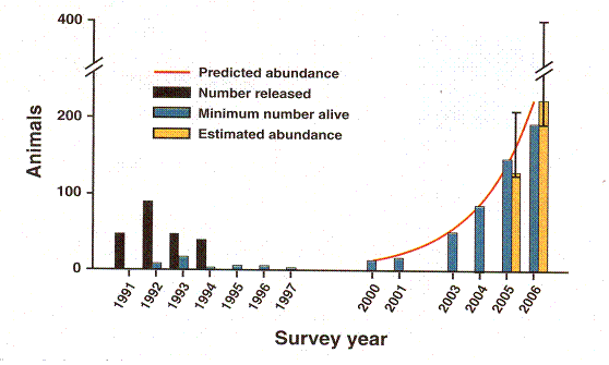
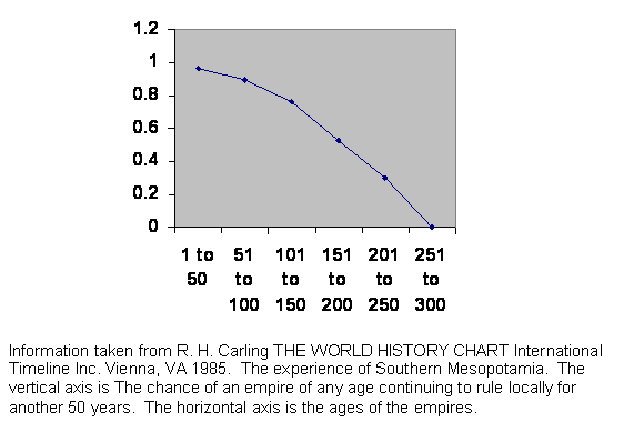
Figure 2 Real world data comparing average number of offspring and relatedness in Iceland, including a measure of the variability.
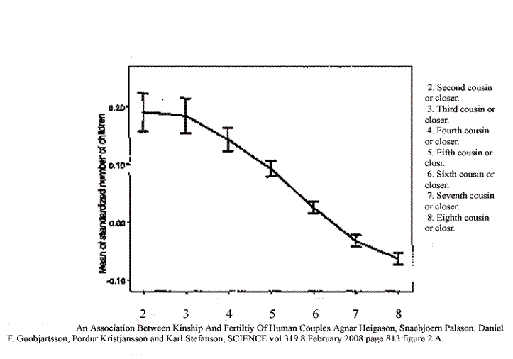
This image includes information taken from a graph in an article from Iceland published in February of 2008. The vertical axis is the relative number of offspring. The horizontal axis is the relatedness of couples. They went back ten generations in the exhaustive genealogy of Iceland and calculated the number or ancestors and hence the effective distance as second cousin or closer, third cousin or closer (but not so related as second cousin) and so forth. We shall compare their results with our calculated predictions.
First is the easiest case. In the model we found that a population of five goes extinct, and the Iceland study does not even include sibling or first cousin marriages. Apparently Icelanders have long known that in the long run this is a bad idea. So we claim that in this easiest case of close inbreeding, our prediction matches reality.
Their peak birth rate is for second cousins. That is total number of children. Grandchildren were a different story, and second cousin marriages did not yet reach the maximum number of grandchildren. None the less, there is a rapid rise in fertility, just as there is in the model, so that is two ways in which the model and reality agree.
After the peak, there is a rapid fall in fertility in the Iceland study. We see the same thing in the computer model. The number of offspring in the model falls rapidly at population sizes greater than 20. So that is three points of agreement.
Over progressively greater separation, the fall in fertility levels off somewhat in the Iceland study. That, too, is in agreement with prediction of the model, so that is a fourth point of agreement.
The Iceland study included error bars, and the error bars indicate a higher variability in the number of offspring at the level of second cousin than at somewhat higher levels of unrelatedness. That matches the higher extinction rate we found at the lowest population sizes, so that is a fifth point of agreement.
From fourth through sixth cousins, the error bars are very tight in the human study. That is in general agreement with our model, which shows greater stability in population sizes in the low hundreds with their low extinction rates. So that is a sixth point of agreement.
Out at eighth cousins, the error bars are about the same size, but their percentage of the total number of offspring rises, suggesting that fertility is less stable at that level. That is in agreement with our model, which shows higher rates of extinction with population sizes higher than the low hundreds. That makes seven points of agreement.
Usually one expects a model to produce fairly clean predictions and the real world data to be more haphazard. In this case that expectation is reversed. The real data set is cleaner and more predictable than the model. We believe that this is due to a much larger sample size, so that stochastic chatter is the cause of our higher variability. However the Iceland study does not carry their results past eighth cousins, and it is at the equivalent of somewhat larger population sizes that our variability becomes very pronounced. This then does not constitute another point of agreement, but it is not in conflict.
Finally, since our model is a pure simulation, there is no place in it for conscious choice. Everything depends on relatedness. Notice at the level of fifth and sixth cousin how tight the error bars are. Those represent 95 percent confidence limits. Virtually no couple related at the fifth cousin level has as few offspring as anyone at the sixth cousin level. We explain this by saying that choice can reduce but not increase fertility, and that the study population does not in fact choose to reduce it.
Contained within those error bars are accident, statistical variation and the often conflicting elements of choice. So there is very little room for choice. Presumably the people by and large do not even know whether they are related at the fifth cousin level or the sixth cousin level. The effect only becomes visible after an exhaustive search of the archives. And presumably those that are more related and less related than the marriages at the most stable level do not really have any more choice; they are just demonstrating the instability of populations away from the valley of stability predicted by the calculation. So that is an eighth point of agreement between the two.
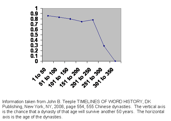
Figure 3 Diagram of the correlation of fertility, marital radius, urbanicity, education and income in a Danish population.
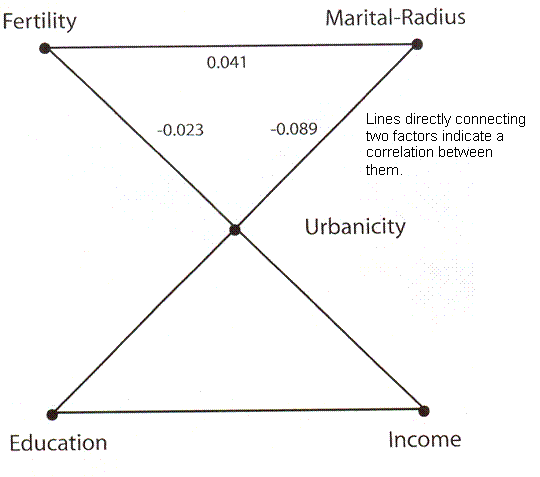
Human Fertility Increases with marital radius. Rodrigo Labourian and Antonio Amorim. GENETICS volume 178 January 2008 page 603 figure 3. Factors connected by straight lines indicates have a correlation between them.
This is a diagram taken from a paper using data collected in Denmark. The authors claim, and their data prove, that in Denmark at the time the data set was collected the greater the distance between the birth places of a man and a woman who married, the more children they would have. The effect is rather strong for distances up to 30 kilometers and then tends to level off. Superficially, this would seem to be in conflict with our understanding that closer relatedness, barring siblings and very close cousins, the more children a couple will have. One is reminded of the Baby Boom just after World War II, when there was a surge in birth rate followed by a decline. We shall revisit this issue later.
The authors went on to compare birth rate with what they call “urbanicity,” or the size of the town or village where the couple lived and which they point out correlates with effective population size, with income, with education, with “marital radius” or the distance between their birth places and with the number of offspring. What they found was that there was a positive correlation between marital radius and number of offspring, this being their central point. They do not emphasize it, but according to their graph, there is a negative correlation between urbanicity and number of offspring, meaning that in spite of any transient advantage of greater genetic difference the larger gene pool is eventually penalized in its birth rate. Also income and education correlated with urbanicity, although they do not give us numbers. What they did not find was any correlation between income or education and number of offspring once urbanicity was considered.
Since free choice is generally taken to involve comparing resources and goals and since resources roughly speaking means income while goals must be strongly related to degree of education, they conclude that there is no room for any statistically significant choice. Or, I believe, the study population seldom if ever chooses to restrict fertility. Once urbanicity and relatedness are established, nothing else influences maximum fertility. This we also found with the Iceland data and assumed for our own model. This is not a new prediction that is being justified, but is a completely different approach to a completely different set of data with the same result.
There is freedom of choice in marriage partner, but it ends there. Any freedom about family size, except perhaps the ability to eliminate offspring, is left at the altar.
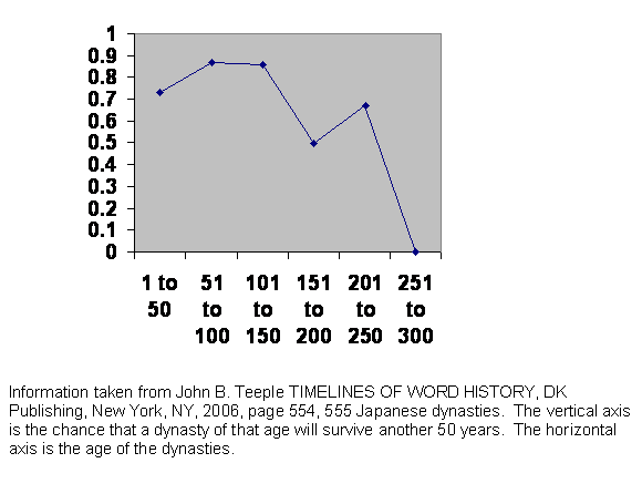
Figure 4 Graph of a typical wild population over time comparing growth rate with population density.
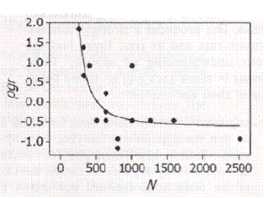
On the Regulation of Populations of Mammals, Birds, Fish, and Insects. Richard M. Sibly, Daniel Barker, Michael C. Denham, Jim Hone, Mark Pagel SCIENCE VOL 309 22 JULY 2005 page 609 figure 1. The vertical axis is the population growth rate. The horizontal axis is the population size as estimated from population density. This is one of more than a thousand species analyzed, typically with the same shape of curve. They point out that growth rate should be very low at low population sizes because inbreeding depression is well established, but they did not observe it.
This graph is taken from work published by Sibly et al. What they did was to look at every published study of wild animal population densities. If you went into the same meadow and counted bunnies at the same time every year for many years, your bunnies never went extinct, and you published your findings, they included your study. There were over a thousand suitable studies. What they expected was that the curve would be convex upward. That is the growth rate should be low at low densities because of inbreeding depression, should soon level off and then should go down as the population reaches the carrying power of the environment. Instead the curve is inside out, concave upward. In their text they assert that since inbreeding depression is known to occur, the curve must start out very low, but they never saw it happen. If we were to add a data point of very low growth rate at very small population size, the curve becomes our now nauseatingly familiar curve predicted by arithmetic.
This does not represent an additional prediction of the model. The model already predicted the same thing in Iceland. It only adds more data, lots more data.
Figure 5 Computer generated example of the history of a virtual population that is allowed to become large.
Experience of one population limited to 20,000 reproducing members. The total survival before the population went extinct was 169 generations shown on the horizontal axis. Vertical axis is the number of offspring in each generation.
There are three critical predictions. The first is that between cycles the population size stays very low for a time. At innocent first glance, one might shrug and say “depressed fertility because of inbreeding,” and there may be an element of that. But we know that is not the whole story. The population would in all likelihood have survived and not fallen to a very low level if it had been limited to 200.
The second prediction is that the growth and collapse occur according to a very stereotyped pattern. It takes about the same length of time for a cycle to run through, whether the population survives for one cycle or for two or more. The shape of the curve is memorable. It is shaped rather like a guillotine blade. The reason for that is that the population is limited to 20,000 potential parents. As the population rises and that number is reached, the number of offspring cannot continue to rise exponentially. The curve is truncated, resulting it its troubling shape.
The third prediction is visible precisely because of the fact that the curve is truncated. For many generations, the number of reproducing pairs is fixed. We see a steady and inexorable decline in fertility until it falls below replacement, at which point the bottom drops out.
Figure 6 Experience of an attempt to reintroduce ferrets into the wild.
Rapid Population Growth of a Critically Endangered Carnivore. M. B. Grenier, D. B. Macdonald and S. W. Buskirk SCIENCE volume 317 10 August 2007 page 779 figure 1. The vertical black bars are the number of black footed ferrets released. The vertical grey bars are the number counted. Years of release or counting are along the horizontal axis.
This graph records the experience of an initially discouraging but ultimately brilliantly successful effort to reintroduce the critically endangered black footed ferret into the wild. Between years 1991 and 1994, ferrets were released in Shirley Basin in Wyoming. The population remained so low that they even stopped counting them. But after the year 2000, growth is exponential, the animals finally spreading into areas beyond what was covered by the study. The conspicuous thing is the delay. No ferrets were released for 6 years, and when counts were performed, there was no evidence for any growth at all. This very precisely fits our expectation from the guillotine curve. It seems the animals had to be left alone for years during which they were able to sort out their genes and get a truly healthy combination. Only after the delay that the model predicts and experience shows is there the rapid exponential growth that the model predicts and experience shows. That makes nine points of agreement. This study was published after the Sibly et al. study. Otherwise, they would have got their example of what would have looked like inbreeding depression.
Figure 7 Experience of the survival of Chinese dynasties.
The guillotine curve suggests that if a population is truly large, a mating pool of thousands or more, then it will collapse at a predictable interval after it first began to become large. The implication for cities is obvious. A city, even a large town, if the society is not highly structured, is doomed to collapse within that interval unless there is a high rate of immigration. Modern urban populations are very mobile, and things have been happening very fast in the last century or two, but we might expect to find the effect among ancient city states ancient empires or ancient dynasties, anywhere that there is an urban civilization with a large privileged class of administrators, who would enjoy social mobility and a wide range of discretion in their mating choice.
This is the experience of China. As we see, the dynasties are all but indestructible for about 300 years, after which they all collapse. If we knew nothing else about Chinese history, we might well guess that it has been a highly centralized civilization. The emperor and his cronies, his capable administrators and military officers, have been a single privileged class. Everyone else has consisted of peasants living in little villages with little opportunity to leave those villages or do much of anything they have not always done, although in fact the junior administrators were recruited from the unprivileged masses.
The core of powerful people runs its course along the blade of the guillotine, which is about 300 years. (This is far shorter than the curve in the model, but nature holds us to stricter account than does the model.) Then they have a demographic crisis, cannot produce enough young people to staff the positions of power, and the whole thing collapses. Since everyone else is peasant, whoever is sucked into the power vacuum does so unopposed, so there is no shakedown period. Having the small gene pool of rural people everywhere, they enjoy the full length of the blade before they too collapse. The existence of the guillotine curve is proven and the model is vindicated for the tenth time.
The actual dates are: Western Zhou 1000 to 771 BC. Eastern Zhou, Spring and Autumn Period, 771 to 481 BC. Eastern Zhou, Warring States Period, 481 to 221 BC. Qim Dynasty 221 to 206 BC. Former Han Dynasty 206 BC to 9 AD. Wang Mang Interregnum, 9 to 23. Later Han Dynasty 25 to 220. Three Kingdoms 220 to 280. Western Jin 265 to 317. Eastern Jin 317 to 420. Wei Dynasty 386 to 543. Sui Dynasty 581 to 618. Tang Dynasty 618 to 906. Five Dynasties 907 to 960. Liao Dynasty 937 to 1125. Song Dynasty 960 to 1279. Southern Dynasty 1127 to 1279. Hsi-Hsia Dynasty 960 to 1227. Jin Dynasty 1119 to 1234. Yuan Dynasty 1260 to 1367. Ming Dynasty 1368 to 1644. Qing Dynasty 1644 to 1912.
Figure 8 Experience of survival of Japanese dynasties.
This is the experience of Japanese dynasties. It is different. If we knew nothing about Japanese history, we might guess that unlike China, Japan has usually had powerful families with resources independent of the emperor. Each of those powerful nobles would have been supported by his own retainers, his own bureaucracy with capable administrators, who generally would have had more mobility and greater discretion in social matters than the primary producers they governed.
This has resulted in two things: for one thing, when a dynasty has fallen, the new incumbent has often been opposed. There was often a power struggle in the first generation or two, and sometimes the emperor and his people lost. After that, the chance of survival rises. The second effect has been that the new emperor and his cadre of elites have not had the tight knit rural gene pool. They were already part way along their own guillotine curve, so even if they did manage to make it past the two generation shakedown, they did not survive to see three centuries or about 10 generations pass.
This does not constitute a new kind of evidence. It is simply still more or the same kind of evidence.
The actual dates were: Japan united 350. Chinese style constitution 604. Centralized administration 645. Heian period begins 794. During this period, the emperor’s power declines and it falls into the hands of the Fujiwara clan. Military takeover 1185. Muromachi period begins 1339. Muromachi period ends 1573. Japan isolates itself 1637. Shogun assassinated 1859. Meiji restoration 1868. German style constitution 1889.
Figure 9 Experience of survival of Egyptian governments.
If we did not know where this history was from, we might guess Egypt, since the time scales of the power structures run out for such a vast distance, up to 700 years. If we did not guess Egypt, then we would probably not be able to figure out what was going on. We could only conclude that there was something very unusual about this place.
To begin with, there is a prolonged shakedown period. For two hundred years any government is still proving itself. Lifetimes have passed since the takeover. The unusual thing about Egypt is its shape. Above Cairo, the Nile valley is only about six miles wide. With the river in the middle, each bank is less than six miles wide. Everybody is within an hour’s walk either of the river or the desert or both. This makes administration difficult to set up. One may be able to subdue a population by setting up outposts every ten miles in a square pattern. But in Egypt those outposts would not control a ten mile square but a much smaller area. That means they would be more expensive to staff and supply. Also communication would be slow and vulnerable along the vast stretch of the river. It is a setup for resistance to defy the central authority.
Then after two centuries there is the usual nosedive as the dynasties or governments approach 300 years old. We have seen that before and are not surprised.
But then, unexpectedly, those that make it past the 10 generation crisis are very stable indeed. Most of the time they are more stable than at any earlier time or indeed any other place we have looked at. That, again, is a secret of the Nile. Once the government is in place, the local administrators have the usual social freedom and discretion of mating choice, but that choice is limited, not by politics but by geography. Of course powerful people would travel on the river, but an executive on such a trip would have a large number of things to do in the time available in any one place. There would not be time for social dalliance. And when not traveling on official business, the member of the elite class is still as hemmed in by river and desert as any farmer.
Even if there were no tradition of close family marriages in Egypt, the geography would assure a smaller effective gene pool size in any location, the talented elite would have enough children to survive and the regime would endure.
It would be hard to make that argument, of course, if we had not seen the guillotine at work on other societies.
The actual dates are: Early Dynastic Period begins 3100 BC. Old Kingdom begins 2686 BC. Snefru’s Dynasty begins 2613 BC. 5th Dynasty begins 2494 BC. First Intermediate Period begins 2160 BC. The Middle Kingdom 2040 BC. The Second Intermediate Period Begins 1786 BC. 19th Dynasty begins 1320 BC. 20th Dynasty begins 1200 BC. Tanite 21st Dynasty begins 1085 BC. 27th Dynasty begins 525 BC. Saite 28th Dynasty begins 404 BC. 29th Dynasty begins 399 BC. 30th Dynasty begins 380 BC ends in turmoil 338 BC. Darius III takes control 335 BC. Alexander’s empire defeats Persians at Issus 333 BC. Egypt handed over to Alexander 332 BC. Alexander dies 323 BC. Octavian conquers Egypt for Rome 30 BC. Arab conquest 642. Tūlūnid Dynasty begins 868. Chaos begins in 905. Ikhshīdid Dynasty begins 936. Fātimid Dynasty begins 969. Ayyūbid Dynasty begins 1171. Mamlūk Dynasty begins 1250. Ottomans begin 1517. French occupation 1798. British occupation 1882 lasts to 1952.
Figure 10 Experience of survival of Mesopotamian empires.
This is the experience of Mesopotamia. If we knew nothing else about the place, we could guess that it is prime real estate. Indeed, it is fertile, has equable weather and is free of mountains or dense forests that would impede communication. It is just the place for an empire.
Look at the curve. Tell your friends in the physical sciences to eat their hearts out. Only rarely can they produce such a clean set of measurements without imposing strict controls, but we are seeing predictability in a very complex and mostly uncontrolled environment.
The land is so desirable that there has usually been some great power waiting in the wings to take over when the current regime falters. There is no shakedown period. The conquering power was already well organized and in the habit of command. On the other hand, each of those powers was already moving along the guillotine curve itself. The moment of opportunity had little to do with the conqueror and much to do with local demographics, so the point of the curve where the conqueror found itself was just about random, producing a clean line falling almost straight from near invincibility to hopeless doom. That is not to say all localities would follow the same pattern. The English have been an exception, which we will not examine now. Greece and Rome present problems in geographic and demographic definition over time scales.
In name, the Ottoman Empire outlived the 300 year brick wall, but their administrators, the Janissaries, were of two sorts. Initially they were slaves from subjugated parts of Europe. But the Ottomans found in time they could no longer recruit as many as they needed, and the Janissary position became hereditary. Since we are concerned with demographics, we count the Ottomans as two different regimes.
Again, this is not to say that this is a new kind of information supporting our genetic model. It is just more data. It is a lot more data.
The actual dates are: Rounding to the nearest 5 years, the early dynastic period lasts 200 years, Sumer 250, Akkadian 150, from the end of the Akkadian to the Gutien invasions 75, Gutien invasions to Ur 155, Ur 120, Isin-Larsa period 100, Old Babylon 300, Kassite 140, Hittite 180, Middle Assyrian 185, Chaldean 175, Late Assyrian 290, New Babylonian 60, Persian 210, Alexander the Great's empire 30, Selucid 240, Roman 190, Parthian 210, Sassanid 280, Ulmayad 120, Abbasid 200, Bayid 110, Turk 170, Mongol 160, Tamerlanes's empire 120, Safavid 240, Ottoman Turk with drafted Janissaries160, and afterward for 220 years.
Figure 11 Past and projected size of world population, middle estimate.
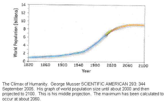
This is a graph of the world’s population size taken from SCIENTIFIC AMERICAN. There are three parts to the graph. The first part is up to about 2000 using the best estimates of the historical population size. At about 2000, the curve reached an inflection point. It had been proceeding with such mathematical precision, that once the rate of growth ceased to rise and started to fall, it was possible to estimate the size of greatest population and the time. That happens at about 2060. Past that, it is pure conjecture. The researcher simply drew thee diverging lines and said it could go anywhere within a range.
For our purposes, the important number is the time between the observed inflection point and the projected maximum. That is about 60 years. The takeoff of the rise is subtle enough so that it is not quite clear when exponential growth began, but if we subtract 60 years from 2,000 we get about 1940, which looks close enough on the graph and is not long before the baby boom got started. That gives us 120 years from takeoff to maximum. The guillotine cure is crudely symmetrical if not quite, so we might guess that the fall will also occur over 120 years.
Now this is a shaky bit. We shall assume that the population size reflects the birth rate with a delay. In other words, although the baby boom began later, world births actually may have been trending upward already. This, too, is consistent with the published graph. So if we take it that birth rates are cycling from takeoff to crash over 240 years, then births fall to zero after that long, but there are still many people alive, many of which are fairly young. Civilization does not collapse until the youngest of them begins to get old in about another 60 years.
In other words, the graph shows that the world is already well on its way on a 300 year cycle that ends in conditions that, if it were an ancient empire, would mean collapse. The same time scale that has operated throughout history is visibly operating right now.
Since this is an entirely different kind of information, and again predictable from the model, we claim an eleventh vindication of the model.
Figure 12 Birth rates in the developed world.
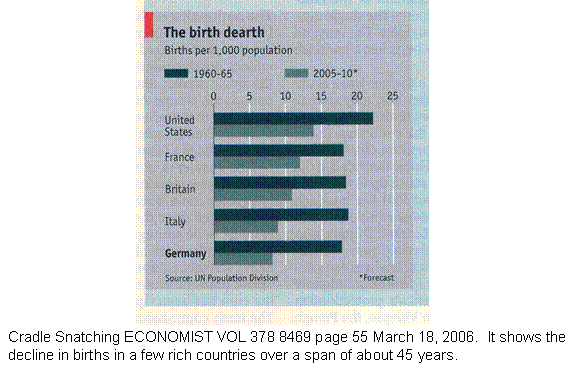
This shows the actual and projected experience of births in the United States and 4 European countries over about 45 years extending a few years into the future. At a glance, one can see that the decline, if extended for 60 years indicates a fall in births by about a half.
While the world population size demonstrates the birth trajectory in the first half of the curve with high birth rate, this shows the birth trajectory late in the process with low and rapidly falling birth rates. The time course is about the same. Since this tests a different part of the curve, and since this is again a different kind of data, we claim a twelfth independent verification of the model.
Figure 13 Age distribution of German males in the year 2005.
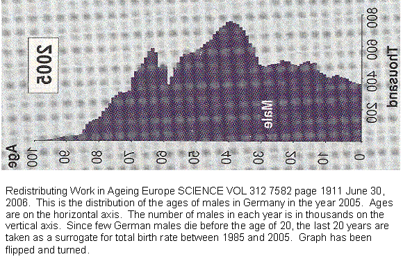
This graph shows the age distribution of German males in the year 2005. Since male births and female births are roughly equal, and since few Germans die before the age of 20, we will use the last 20 years as a measure of German births. We already know that it is declining. But look at the last 8 years. The fall is almost a straight line. That is what we would predict from our guillotine curve. That makes it a thirteenth independent validation of the model. There are notches in the blade for those over 8, so we guess that until recently Germans did deliberately restrict fertility.
The graph is troubling. If that straight line is extended, it falls to zero within the reproductive life span of a normal woman. In other words, assuming nothing changes, the last German who will ever have children has already been born or soon will be.
Not only does the survival of the great cultural adventure that has been Germany seem so critically imperiled, but we have already seen that it takes some time to turn fertility around. Those ferrets did not begin exponential growth the day the last were released in the wild. And what will happen to a world fifty years from now? The planet will only feed 2 billion people without constant research by the part of the population interested in science and high technology. If they vanish and leave behind almost 10 billion people, it will be a dark age even if births in theory could continue for decades.
The prospect is so bad that even I can’t stand it.
Figure 14 Table of survival of populations established by a pair from the same population and from each of two populations that have been separated for 2,000 generations.
Speciation
| Gens split | ||||||||||
| none | 1,000 | 1,000 | 1 | 1,000 | 1,000 | 5 | 1,000 | 1,000 | 1,000 | 1,000 |
| 2,000 | 2 | 2 | 2 | 2 | 2 | 2 | 2 | 2 | 2 | 2 |
Number of generations of survival of 10 populations started by 2 random members of the same population after 1,000 generations and started by 2 random members of populations separated for 2,000 generations. 1,000 is the maximum survival permitted.
In the top row above, random pairs have been taken from a population of 200 that had survived 1,000 generations. When they were run for 1,000 generations more, most survived but not all. In the second row, populations of 200 had been separated for 2,000 generations, and 1 member of each was taken to try to establish a new population. All died out. Thus we have speciation. In fact, they did not die out in the first generation but the second, so we have speciation with hybrid sterility. So that is two more known facts that the model accounts for, for a total of fifteen successful predictions.
Looked at another way, even though the crossbreeding is fatal, there is a transient advantage to it that keeps the population alive long enough to try a second generation. Elsewhere, that advantage accounts for the Danish study that shows a first generation advantage with increased fertility with increased distance between the birth places of a couple, but showing a longer term disadvantage whereby the urban population with the greater gene pool size has the lower fertility. That makes sixteen predictions born out.
This is research, not advice. Linton Herbert
Return to home page.