Double vindication and a review:
Two exciting new things have happened. The study by Rodrigo Labouriau and António Amorim concerning marital radius and fertility in Denmark has been supplemented with further data. (Comment on “An Association Between the Kinship and Fertility of Human Couples,” Rodrigo Labouriau and António Amorim SCIENCE vol 322, page 1634b December 12. 2008) More on this later.
Also a paper has recently been published that reflects in some measure my own calculations. (Rick Durrett and Deena Schmidt, Waiting for Two Mutations: With Applications to Regulatory Sequence, Evolution and the Limits of Darwinian Evolution GENETICS vol. 180 no. 3 November 2008 page 1501) The interest of that paper was in the mutual tuning of a signaling system. Part of the impetus to write the paper was that someone had calculated how long it would take for a single signaling system to turn up by chance with appropriate mutual tuning; the answer in the paper cited by the Durrett paper was that it would take longer than the age of the known universe. The authors of the current paper do their calculations and conclude that it would by no means take so long, and in fact that the appearance of such systems by evolution was moving slowly along at just the rate one would expect from known mutation rates.
The model they pursued was something like this: imagine an organism with a signaling system with “a” as the transmitter for some receiver. Occasionally “a” will be degraded by mutation to “a prime” which is an inactive form. This will do little harm, since the individual carrying “a prime” should have, on another chromosome, a copy of “a” which works perfectly well. Thus “a prime” will persist at some low proportion in the population for an extended time. Meanwhile there is a site “b prime” which is initially inactive. Occasionally “b prime” will be altered by mutation into “b,” which is now a satisfactory match to the receptor and functions about as well as “a.” In time “b” can thus replace “a,” and the rate at which this occurs is calculated. They ran computer simulations, 10,000 simulations for each virtual data point, and produced graphs of their results using various sets of assumptions. Here is their first graph:
.
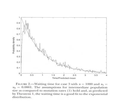
Figure 1. Taken from Rick Durrett and Deena Schmidt, Waiting for Two Mutations: With Applications to Regulatory Sequence, Evolution and the Limits of Darwinian Evolution GENETICS vol. 180 no. 3 November 2008 page 1505, their figure 2. The horizontal axis is the time axis waiting for the two events. The vertical axis is something called “probability density.”
I am sorry I am unable to give you a strict definition of “probability density,” which is their vertical axis. However the time axis seems obvious. The irregular line is the computer simulations. The smooth line is a predicted exponential, which fits well in this case except for very early. The graph going from left to right starts low, rises rapidly, falls rapidly and then levels off.
Using a program I have introduced previously on this web site, I created a series of simulations of populations limited to 5, 20, 200, 400, 600, 800. 1000, 1200, 1400, 1600, 1800 and 2000 with 10 repeats per simulation. Each population started at 100 and ran for up to 1000 generations if it did not go extinct. Individuals mated at random. There were 6 offspring per couple less the number that were eliminated because of genetic mismatches. Offspring in excess of the limit were eliminated at random. Each individual had 2 chromosomes with 100 gene pairs each that were subject to a mutation rate of 400 per 100,000 sites per generation. Each mutation could cause a mismatch that would result in 40 one thousandths of an offspring lost to the couple per generation. A mismatch could be reduced either by a reverse mutation in one gene or a corresponding correcting mutation in its counterpart. The results are in figure 2.
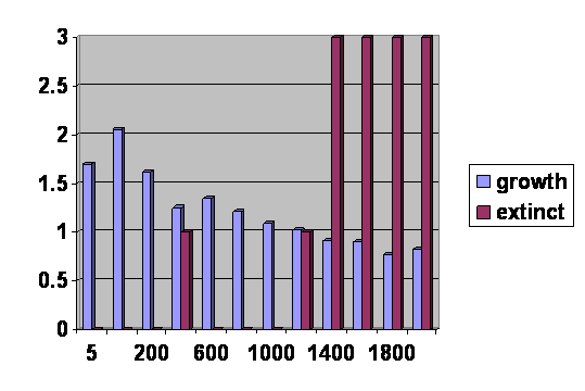
Figure 2. 12 simulations done with 10 repeats averaged using the parameters described above. The vertical axis is the number of populations that went extinct out of the ten (the red bars) and the average number of offspring per individual at generation 1000. The horizontal axis is the population sizes
Notice that the horizontal axis is not linear. That is because of a limitation in the graphic program. In actuality the initial rise and fall are steeper than they appear here.
The plot is disturbed by the presence of extinctions, which do not occur in the Durrett program. None the less it is clearly seen that the line starts low, rises rapidly, falls rapidly and then levels off. This is exactly what happens with the Durrett results.
There are a number of differences between the programs other than the fact that one includes extinctions and the other does not. The Durrett program permits generations to overlap; my program finishes one generation before another is started. The vertical axis on my graph is fertility; the vertical axis on the other program is probability density. The horizontal axis on my program is population size with time to equilibrium rising as population size rises; the horizontal axis on the other program is time. Despite these differences, the shape of the two curves is the same, and I believe I do not have to make further apology for my program. The two programs are very similar and generate the same curve, so my own stands confirmed.
In an effort to be more realistic, I also did simulations that were identical except that they included recessive lethal mutations, 100 genes per chromosomes subject to recessive lethal mutations at a rate of 10 per site per 100,000 generations. The result is given in figure 3.
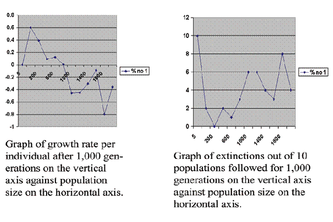 Figure 3. 12 simulations averaging 10 repeats each as in figure 2 except this time recessive lethal mutations are included as described above.
Including the recessive lethal mutations does not change the overall shape of the graph. It does make the curve less stable. At population size of 5 all 10 of the populations went extinct, which leads us into the mathematical sin of dividing by zero, but if we do a sufficient number of runs one will occasionally survive, so the number is not zero but is very small. Again the curve starts low, rises rapidly, falls rapidly and then levels off.
Accordingly, in figure 4 I have sketched in my own result in parallel with the graph from the paper by Durrett et al.
.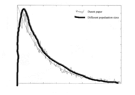 Figure 4, superimposing figures 1 and 3. As for the axes, forget it. We are just looking at the shapes of the curves. The axes are not consistent in scale. This will get worse as we go on.
The two curves are about the same. We already know that. I just sketched one in to match as best I could.
We can go farther with the model. I have asserted that larger populations reflect longer times because it takes them longer to come into equilibrium. I can do better than that. We can take a single population and let it rise to 20,000 using exactly the same parameters that generated the curves in figure 3, When we do that, we can graph the number of total number of offspring in each generation, and we can get figure 5.
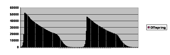 Figure 5. Computer simulation of a population permitted to rise to 20,000 parents using otherwise the same parameters that generated figure 3. Number of offspring on the vertical axis, and generation number is on the horizontal axis. Each cycle is about 80 generations long, far longer than what is seen in real life. A more realistic picture could be generated by having more computing power and tweaking the program.
Once again we have a curve that goes up rapidly, drops rapidly and then levels off, particularly after falling below replacement levels, which here would be 20,000 offspring for a population of 20,000. The curve looks different because it is truncated. As you can see, the number of offspring tends to cycle. The number skyrockets, declines to almost zero and then may or may not undergo another cycle. If we did a number of repeats, we would see that commonly it goes extinct after the first cycle, less often cycles twice and more and more rarely undergoes more cycles.
After the first cycle, which is a sort of a shakedown and is affected by starting conditions, the population spends a time near zero and then shows explosive growth. That growth is not exactly exponential. If we take the actual numbers of offspring each generation between takeoff and the first corner of the truncated curve and divide by the number of parents, we get figure 6.
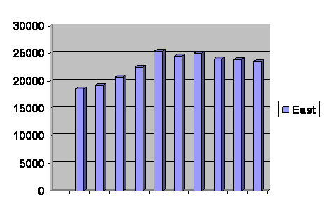
Figure 6. Offspring per parent in the computer simulation during rapid growth. Vertical axis is offspring per parent. Horizontal axis is generations.
As you can see, while the population is recovering from inbreeding depression, the fertility actually rises. It soon begins to decline again, even before the population reaches its limit of 20,000.
Between the corners of the curve in figure 5, the fertility is seen to decline almost linearly and then levels off somewhat. It levels off even more after the second corner. In fact, by the time the population reaches a dozen or so it has more than leveled off. The number off offspring per parent rises until it is approximately at replacement levels, where it remains until either it recovers as it did after the first cycle or goes extinct as it did after the second cycle. In short, fertility skyrockets, soon falls again and then levels off just as the other curves have done. Accordingly in figure 7, I have sketched in the curve as following the same shape as the other curves, understanding that I am leaving out the recovery of a degree of fertility as the population reaches very low levels.
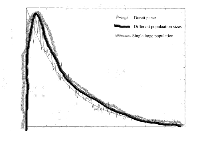 Figure 7. This is figure 4 with the experience of the second cycle of figure 5 sketched in. The recovery of fertility once very low population size is reached has not been included.
Content now that the three mathematical formalisms (one from the Durrett et al paper and two generated by the program) reduce to the same thing, we shall go looking for real world data and see how it fits in.
First we will look at a graph from a paper (Rapid Population Growth of a Critically Endangered Carnivore. M. B. Grenier, D. B. Macdonald and S. W. Buskirk SCIENCE volume 317 10 August 2007 page 779 figure 1) about reintroducing black footed ferrets into the wild.
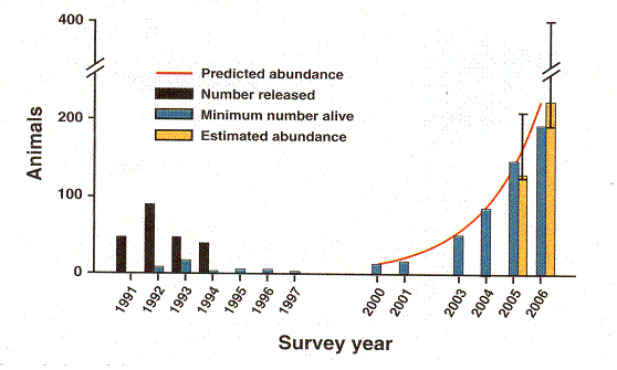

Rapid Population Growth of a Critically Endangered Carnivore. M. B. Grenier, D. B. Macdonald and S. W. Buskirk SCIENCE volume 317 10 August 2007 page 779 figure 1. The vertical black bars are the number of black footed ferrets released. The vertical grey bars are the number counted. Years of release or counting are along the horizontal axis.
Figure 8 Experience of an attempt to reintroduce ferrets into the wild.
This graph records the experience of an initially discouraging but ultimately brilliantly successful effort to reintroduce the critically endangered black footed ferret into the wild. Between years 1991 and 1994, ferrets were released in Shirley Basin in Wyoming. The population remained so low that they even stopped counting them. But after the year 2000, growth is exponential, the animals finally spreading into areas beyond what was covered by the study. One conspicuous thing is the delay. No ferrets were released for 6 years, and when counts were performed, there was no evidence for any growth at all. This is what happened with our computer simulation in figure 5. There, too, we saw a period of no growth followed by explosive growth. When growth did occur, it was not exactly exponential, but exceeded and then fell short of exponential growth, just as the ferrets did. Inspecting figure 8 we see the grey bars of actual counts falling short of the red exponential curve in 2001 and 2006 but reaching or exceeding it in between. Accordingly we take it that the rapid growth phase matches expectation and sketch that in. The no-growth phase is not reflected in the composite graph, so we stick it in on the right, understanding that it belongs even farther to the right.
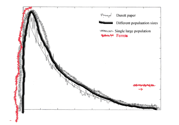 Figure 9. This is figure 7 with the data from figure 8 sketched in. The ferrets show growth duplicating the explosive rise and they are tacked in on the right because they duplicate the lack of growth at a very small population size, which was also generated on the graph but is not included on the composite.
So although the numbers are small, we do have one real world set of observations that matches two parts of the mathematical curves.
This is the other really exciting thing. A larger data set comes from a paper published describing reproductive success in Denmark. They looked at a large number of couples and compared the distance between their birth places with the number of children they had. For the first 30 kilometers, they found a greater distance between birth places was reflected in a greater average number of offspring. After that it leveled off. Now they have gone back and carried the study back in time to include grandparents and outward in distance past 75 kilometers. This is their new graph
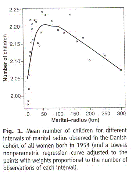
Figure 10 (their figure 1). Graph taken from Comment on “An Association Between the Kinship and Fertility of Human Couples,” Rodrigo Labouriau and António Amorim SCIENCE vol 322, page 1634b December 12, 2008Vertical axis is number of children and percentage of number of mothers with more than two children. Horizontal axis is distance in kilometers between the birth places of the parents.
Much like the what we have seen so far, as kinship decreases going from left to right, fertility rises rapidly and then falls. The fall is concave upward in the Iceland study and linear here, but that is a trifling difference. Area, and thus presumed gene pool size, increases as the square of the distance. To make the line compatible with the mathematical simulations and the ferrets. the graph should be squeezed in on the right and stretched out on this left. Then the curves match very nicely. Accordingly in figure 11 I sketch in this new and thrilling data.
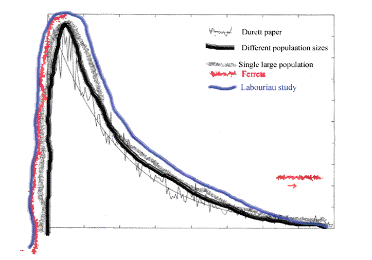
Figure 11. Figure 9 with figure 10 sketched in. This new Labouriau paper follows the Danish experience out to 75 kilometers and beyond. Like the computer simulations, the curve rises rapidly, soon falls and then begins to level off, once the effect of the square of distance law is taken into account.
The data from Denmark follows a rising and falling curve before leveling off. As before, the axes are not labeled because they are not consistent and attempting to define each would be unnecessarily cumbersome in an already cumbersome process.
There was a study done by Sibly et al (On the Regulation of Populations of Mammals, Birds, Fish, and Insects. Richard M. Sibly, Daniel Barker, Michael C. Denham, Jim Hone, Mark Pagel SCIENCE VOL 309 22 JULY 2005 page 609) in which they looked at over a thousand studies that contained field counts of the population densities of mammals, birds, fish and insects. They did not encounter a population in the wild that showed the effects of inbreeding. The black footed ferret study had not yet been published. However, they do say that inbreeding is known to be real, and thus the rising curve is implied but not observed. What they did record, rather to their surprise, was the shape of the falling curve. They give this, figure 12, as typical of their findings.
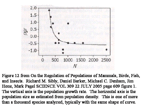
By now the pattern should be no surprise to us. It is simply the descending and leveling out part of the curve we have been observing. I sketch it in with figure 13.
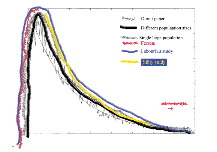 Figure 13. This is figure 11 with figure 12 sketched in.
Figure 13 shows the experience of all of those studies placed in the appropriate part of the curve, which is to say the populations were always too big for inbreeding depression to be observed, so there is no ascending limb to the curve, although we agree that the ascending limb would have been there under the appropriate conditions.
There was a study done in Iceland. There they have an enormous genealogy which effectively covers the entire country for a thousand years. What they did was go back ten generations and look at how closely related couples were. Then they compared relatedness with the number of offspring the couples had. They went so far as to look at the second generation, to see how many grandchildren there had been. Although in the first generation there is no evident ascending limb of the curve, with the grandchildren that ascending limb is evident. Their curve for the grandchildren is given as figure 14.
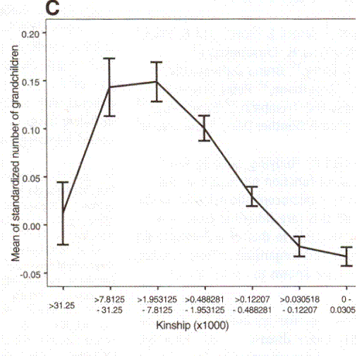
Figure 14. This is taken from An Association Between Kinship And Fertility of Human Couples. Agnar Heigason, Snaebjoern Palsson, Daniel F. Guobjartsson, Pordur Kristjansson and Karl Stefanson, SCIENCE vol 329 8 February 2008 page 813 figure 3 C.
In figure 14, the vertical axis is a measure of the number of children. I take it that the zero line is the level at which there are 2 offspring per couple. The first data point pools those who are the equivalent of second cousins or closer. The second data point pools third cousins or closer but not second cousins and so forth. The optimal relatedness for maximum number of grandchildren is third or forth cousins. Out past sixth cousins the success in having grandchildren is no better than with second cousins and is marginal at best. I sketch in the curve in figure 15.
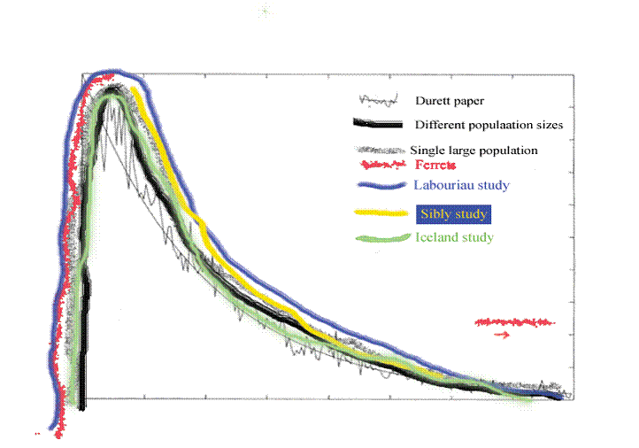 Figure 15. This is figure 13 with figure 4 sketched in.
In figure 15, we see again the ascending and descending limbs of the curve. We would not have seen it had they not taken the trouble to go ahead and look at the second generation, but we could have inferred the ascending limb because we understand that marriages closer than second cousins often have a degree of inbreeding depression. Bear in mind that we do not literally mean second cousins and so forth. What they looked at was the equivalent of second cousins when going back 10 generations.
I must point out that it seems that Helgason et al might not be happy having their data superimposed on the Labouriau and Amorim data. They appear unconvinced that marital radius actually correlates inversely with relatedness in Denmark at the time of the study as it does not always appear to be so correlated in Iceland. (www.sciencemag.org/cgi/content/full/322/5908/1634c ) I suspect that the difference can be resolved by considering differences in the way “marital radius” is measured in the two studies and conceding that there might be differences in the proportion of people who have stayed near their ancestral farms in Denmark. There is also, at least in my mind, the question of how many generations back you go. The Iceland study clearly distinguishes between “fertility” meaning number of children and “reproductive success” meaning number of grandchildren. The recent Danish data includes grandparents, and it is indeed the reproductive success graph of Iceland that they match, as would be expected if they are looking at the same mechanism. At all events the two curves look similar to me, represent large amounts of data and lack any explanation for their clean shapes other than genetic.
For a truly large population of humans we can look at the fertility of everybody in the world going back for fifty years. The UN provides the numbers and most obligingly they have broken them down into most developed areas, less developed areas excluding least developed countries and least developed countries. The experience is graphed in figure 16.
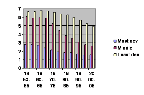
Figure 16. UN numbers. How to find them is described on nobabies.net August 25, 2008. The vertical axis is the average number of children born per woman. The horizontal axis gives the dates of the surveys.
In figure 16, we see the experience of everybody in the world for the past 55 years. Everybody you know between 3 and 58 years old is on this graph. The yellow lines with the highest birth rates are the least developed countries. The red lines with middling fertility are the less developed regions minus the least developed countries. The blue lines are the most developed regions. I find it a bit sad that we do not see a lot of countries leaping from the yellow to blue. We do, however, see that the birth rate in the least developed countries does come down to overlap the somewhat more developed countries.
Assuming that fertility follows the same rules in all populations, it is reasonable to guess that these different regions are simply at different stages along the same curve. To test that, we simply cut and paste, following the yellow lines until they overlap the red, cut to the red and follow them until they overlap the blue and cut to the blue and follow them on out to three years ago. When we do so, we get a composite experience of 115 years. The doctored graph is figure 17.
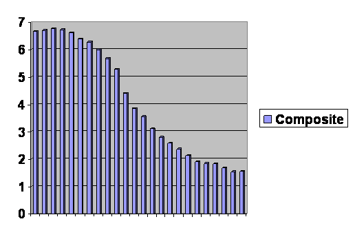
Figure 17. Composite graph of least developed counties from 1950 through 2000, less developed regions excluding least developed countries from 1975 through 2005, and more developed regions from 1970 through 2005. The vertical axis is number of offspring per woman; the horizontal axis is discontinuous, but each bar represents a five year increment.
Figure 17 is over a hundred years of experience. It is hard to tell just where the graphs were cut and pasted because they follow the same curve so strictly. You can dismiss your favorite theory as to why some countries have different birth rates than others. Almost the only visible effective factor is where they are along the curve. At the far left, fifty years ago in the least developed countries, birth rates were very high. Notice that they are not constant. There is a slight bulge as they are escaping inbreeding depression, just as we saw with ferrets, Danes and the computer program. Overall the curve is just as we have been seeing. The birth rate goes up, quickly starts back down and then begins to level off, particularly as it drops below replacement levels. In the last five year interval, there was a slight rise in the birth rate of the most developed regions. This may in fact represent a degree of choice, not to say frantic exertion. It is not because the population of the most developed regions has dropped below a couple of dozen already.
In figure 18 I sketch the data from figure 17 into the composite graph.
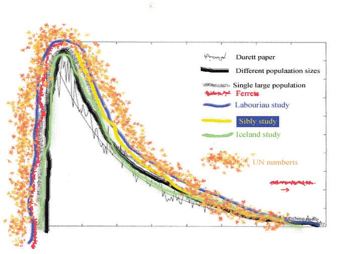 Figure 18. This is figure 15 with the data from figure 17 sketched in.
In figure 18 I have sketched in, rather fancifully perhaps, the UN data on top of the other data and the underlying calculations.
I think there is a pattern here.
There have been 709 visitors so far.
Home page